All products featured are independently chosen by us. However, SoundGuys may receive a commission on orders placed through its retail links. See our ethics statement.
How to read audio charts
April 29, 2025
At SoundGuys, we love data. And you should too. It can make comparing products and making decisions easier. When we present our measured data, we try to make it as pretty and as accessible as possible. But not everyone knows how to read a response chart or what all of those lines mean. We’ll be going over that today.
When you read reviews of headphones, speakers, or microphones, you’ll often run across charts that might be a little confusing, with terminology like “frequency response,” sensitivity, or “attenuation.” These performance points will generally be explained in the review. We do this because we feel like the best way for someone to find the right product for them is to have all the facts in front of them. But if you want to read charts yourself, whether they’re ours or a manufacturer’s, a little know-how is needed.
- This article was updated on April 29, 2025, to update formatting.
- This article was updated on June 15, 2021, to address our new testing setup, which includes a Bruel & Kjaer 5128.
Editor’s note:
What are decibels?
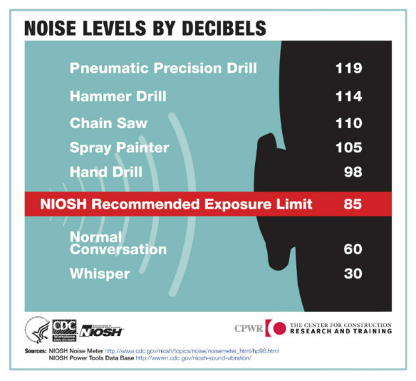
The decibel is used to express a ratio of any two physical values, but is most commonly found in the electrical and acoustic domains. For headphones, speakers, and other audio products, decibels (dB) are a unit of measurement used to characterize sound output. For example, 0dB(SPL) is just barely audible, while 120dB(SPL) will really hurt your ears.
The reason it works well for quantifying audio is because the decibel scale is logarithmic, which mirrors how our hearing works much more closely than a linear scale.
Each decibel, or dB, corresponds to one-tenth of a bel (B), derived from the name of Alexander Graham Bell, inventor of the telephone. A 1dB difference in loudness between two sounds is generally treated as the smallest detectable difference by our hearing system, but this depends on a few things and assumes that you have pretty healthy ears.
What is sound pressure level (SPL)?
Because sound is perceived differently by different people, we need an objective measurement of sound level. This is the function of sound pressure level (SPL).
Sound pressure level (SPL) is the pressure level of a sound, expressed in decibels (dB). As you recall, this is a ratio, and in this case, it’s the ratio of the absolute measured sound pressure against a reference level of sound in the air. The reference sound pressure in air is 0.00002 Pascals.
For every 10dB that your music increases, it will sound roughly twice as loud.
Using this system, 0dB(SPL) is considered the threshold of human hearing, while any sound over 130dB(SPL) will be painful to experience and certainly result in lasting damage. Everything you hear on the day-to-day is somewhere between these two extremes.
Headphones and loudspeaker sensitivity value are almost always quoted in dBSPL for a given electrical input. Microphone sensitivity values are typically expressed as an electrical voltage for a given acoustic input in dBSPL.
How do you read an MDAQS chart?
Let’s break it down:
- Timbre: How faithfully the product reproduces the frequency spectrum (tonal balance) and temporal resolution (timing information).
- Distortion: The extent to which non-linearities and added noise affect the signal.
- Immersiveness: How good the perceived source width and positioning are. How well virtual sound sources are defined in three-dimensional space.
- Overall: How a group of listeners would rate the product’s performance on a scale of 1-5.
In addition to the results produced by MDAQS, each reviewer will provide their own perspective on sound quality in the review for additional context.
How do you read a frequency response chart?
A frequency response chart illustrates how sounds on the frequency spectrum are reproduced by the audio device being assessed, using a decibel scale on the vertical (y) axis, and a logarithmic frequency scale along the bottom (x-axis).
You’ll notice that our response charts hover around the 0dB point on the y-axis. That doesn’t mean we measured the output level way down close to the threshold of hearing: since the units are not dB(SPL), it is referenced to a different level. The measured data have been normalized to make them easier to read by removing the effect of the product’s relative sensitivity; “dB rel.” means relative.
While hearing what a product sounds like is the ideal way to assess whether you like it, seeing what the headphones sound like in objective terms is the next best thing we can offer: which frequencies/musical notes (x-axis) will come in louder or quieter (y-axis) are visually represented by the chart. This gives a good impression of the sound balance and will help you find the right products for you. If there’s a product out there you know you like the sound of, then comparing the shape of the response charts is relatively straightforward.
Loading chart ...
You’ll also be able to see how closely each product meets certain standards or SoundGuys criteria. Here for example, in addition to the frequency response of the product (the bold cyan trace) we also show you what we consider to be a reasonable benchmark for how that type of product should perform (purple).
How do you read an isolation or noise canceling chart?

Noise attenuation is a good thing! Attenuation is another word for reduction. This type of chart shows how much outside noise is either passively blocked by isolation or cancelled by active noise canceling (ANC) (y-axis), and at which frequencies it has the most and least effective reduction (x-axis). From a chart like this, we can learn just how good or bad a set of headphones is at preventing outside noise from entering your ears.
We’ve gone over why isolation is important before, but it bears repeating: the better your headphones are at blocking out sound, the better your headphones will sound in noisy places. The long and short of it is: as well as being annoying, lots of environmental noise can mask parts of the content you’re listening to, so you miss out on quiet parts of your songs, podcasts, and movie audio won’t quite make it if you can’t block the outside noise.
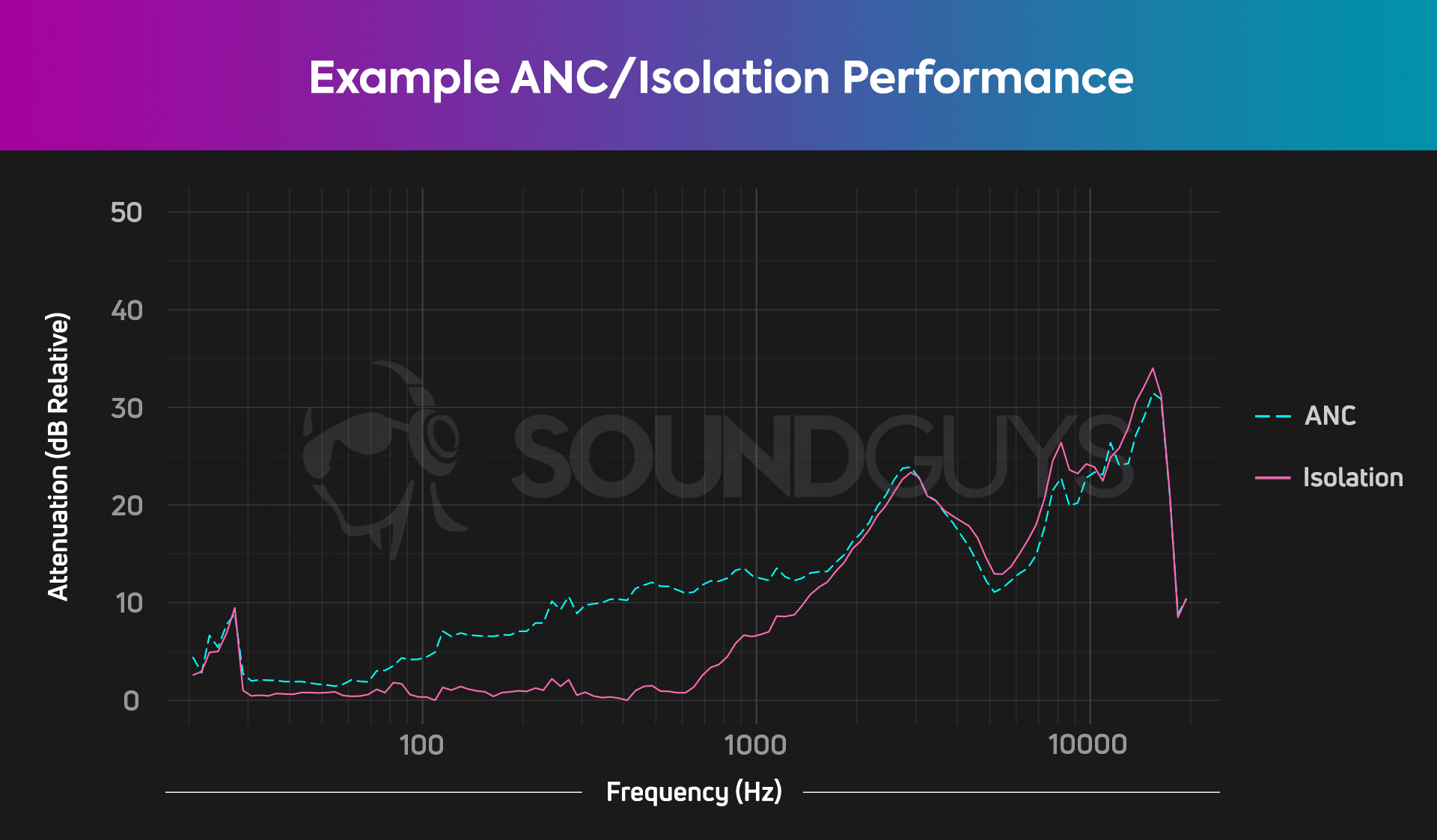
The lines on the chart above represent how well headphones attenuate outside noise. The higher the line, the better the product is at blocking outside noise. If the line sits at 0dB, then it doesn’t block any noise at that frequency. If it dips below 0dB it actually amplifies the outside noise (this is very rare but can happen).
Our active noise canceling scores may seem curious at first glance because the ANC score on each review reflects a product’s gross attenuation (how much noise it passively and actively combats). This can make versus articles a bit odd: when we compare the Jabra Elite 75t to the Apple AirPods Pro, the individual ANC scores indicate that the Elite 75t has more effective noise canceling than the AirPods Pro (6.6 compared to 5.0, respectively). This isn’t technically the case, it’s just what you’ll experience.
Compare the net active noise canceling performance of the Jabra Elite 75t to the AirPods Pro by looking at the 100-1000Hz range. The difference between the ANC and isolation on the AirPods Pro chart is far greater than the difference between these variables on the Jabra Elite 75t chart. Again, total attenuation is greater with the Jabra Elite 75t because its passive isolation is so much better, but you’ll hear a more noticeable difference when you toggle the AirPods Pro’s ANC on and off.
How do you read a microphone frequency response chart?
Just as in the frequency response chart for headphones, microphone frequency response charts show how well the product passes sound across the audio spectrum.
Our voices only occupy a portion of the audible range of frequencies. While speech harmonics extend further, the critical range for voice communication extends up to about 4,000Hz. This covers what you strictly need for phone calls, voice chats, and the like. Therefore most headset mics won’t cover the whole audible spectrum (20Hz to 20kHz) as it’s not necessary.
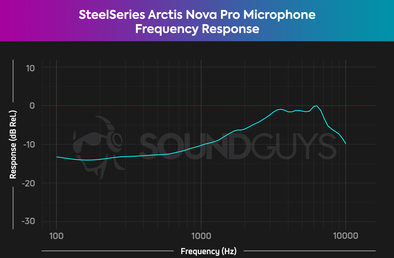
For communication microphones like the ones in headsets, we’d ideally like to see a straight line on this chart, rising slightly towards the upper register. This gives good speech intelligibility, our main concern for this type of product. We also include recorded clips of our voices in our reviews so you can hear for yourself exactly what the microphone actually sounds like.
What is a microphone polar pattern chart?

Different microphones have different directionality patterns. This means that some pick up sounds from all around, and some are more directional and must be pointed at the sound source you want to pick up. Different applications have different microphone requirements. Polar response plots (charts) are used to illustrate this. Some of the most common polar response shapes for microphones are “omnidirectional,” “cardioid,” and “supercardioid.” In the chart below, imagine the microphone’s diaphragm element is right on that horizontal line, with the front-facing the top of the circle, and the back facing the bottom of the circle.
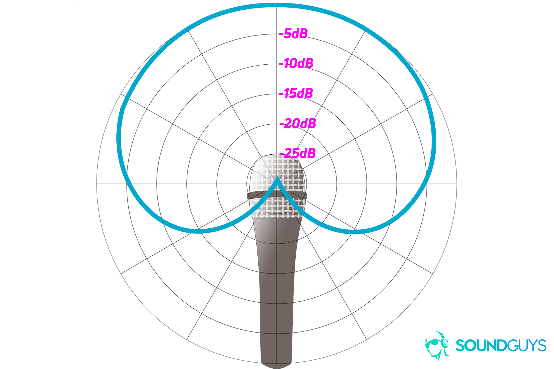
The blue line in the chart above shows the microphone’s sensitivity at various angles of incidence to incoming sound waves. Typically if a single plot like this is provided it will show the microphone’s directional characteristics at a single frequency (typically 1kHz). But the reality is that a mic’s directionality will vary with frequency, and so is not fully described without a series of these plots at different frequencies. The single plot isn’t necessarily any more useful than terms like Cardioid or Hyper-Cardioid, but will give you a rough idea of how best to use the microphone.