All products featured are independently chosen by us. However, SoundGuys may receive a commission on orders placed through its retail links. See our ethics statement.
Touchscreen vs tactile earbud case controls: Sometimes simpler is better
Published onSeptember 13, 2024

When it comes to wireless earbuds, manufacturers are constantly seeking ways to differentiate their products, whether it be a flashy design or a new driver. The latest trend? Adding touchscreens to earbud cases. But is this a game-changing innovation or just a solution in search of a problem?
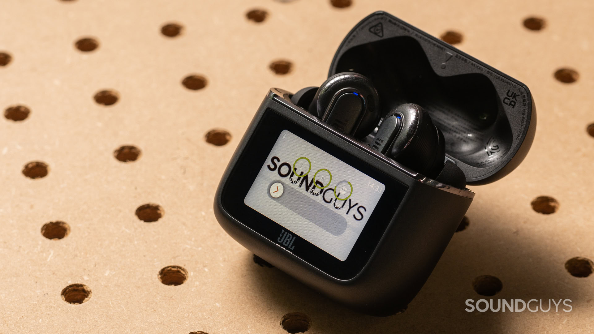
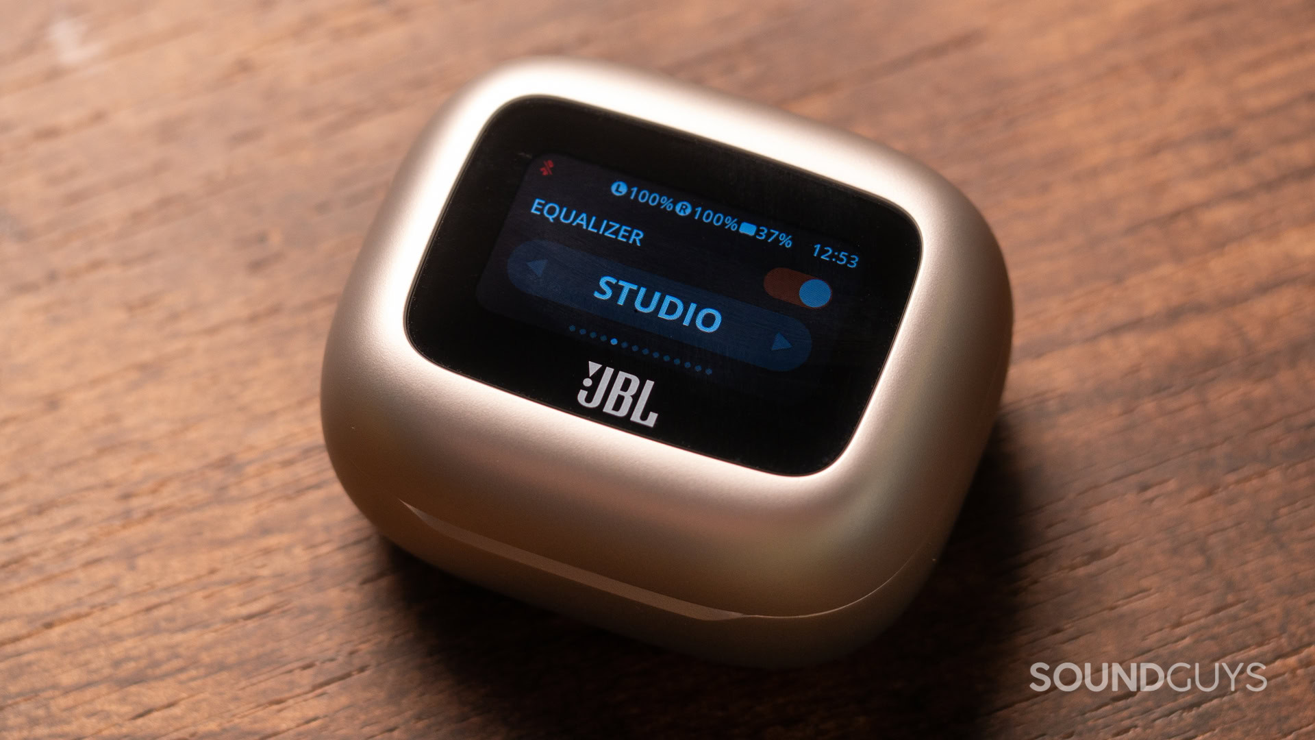
JBL is one brand that has been iterating on this design for the past couple of years, bringing their best touchscreens yet to their Tour Pro 3 and Live Beam 3 models. These mini-displays allow users to control various functions without reaching for their phones or tapping their earbuds. Want to adjust volume, switch tracks, or toggle noise cancelation? You can do so all from the case.
With the app built into the case, there's no need to pull out my phone.
The primary benefit is clear: convenience. No more fumbling for your phone on a crowded train or during a workout. You can make quick adjustments without breaking your stride or interrupting your flow. Plus, by avoiding your phone, you sidestep the temptation of those pesky notifications that always seem to pop up when you least want them.

But let’s pause for a moment. Are touchscreens on cases really the best solution? They add complexity to the device, potentially impacting battery life and definitely increasing the cost. And let’s be honest: Do we really need another screen to look at?
What if I told you there was a way to get all the benefits of case controls without the need for a screen at all?
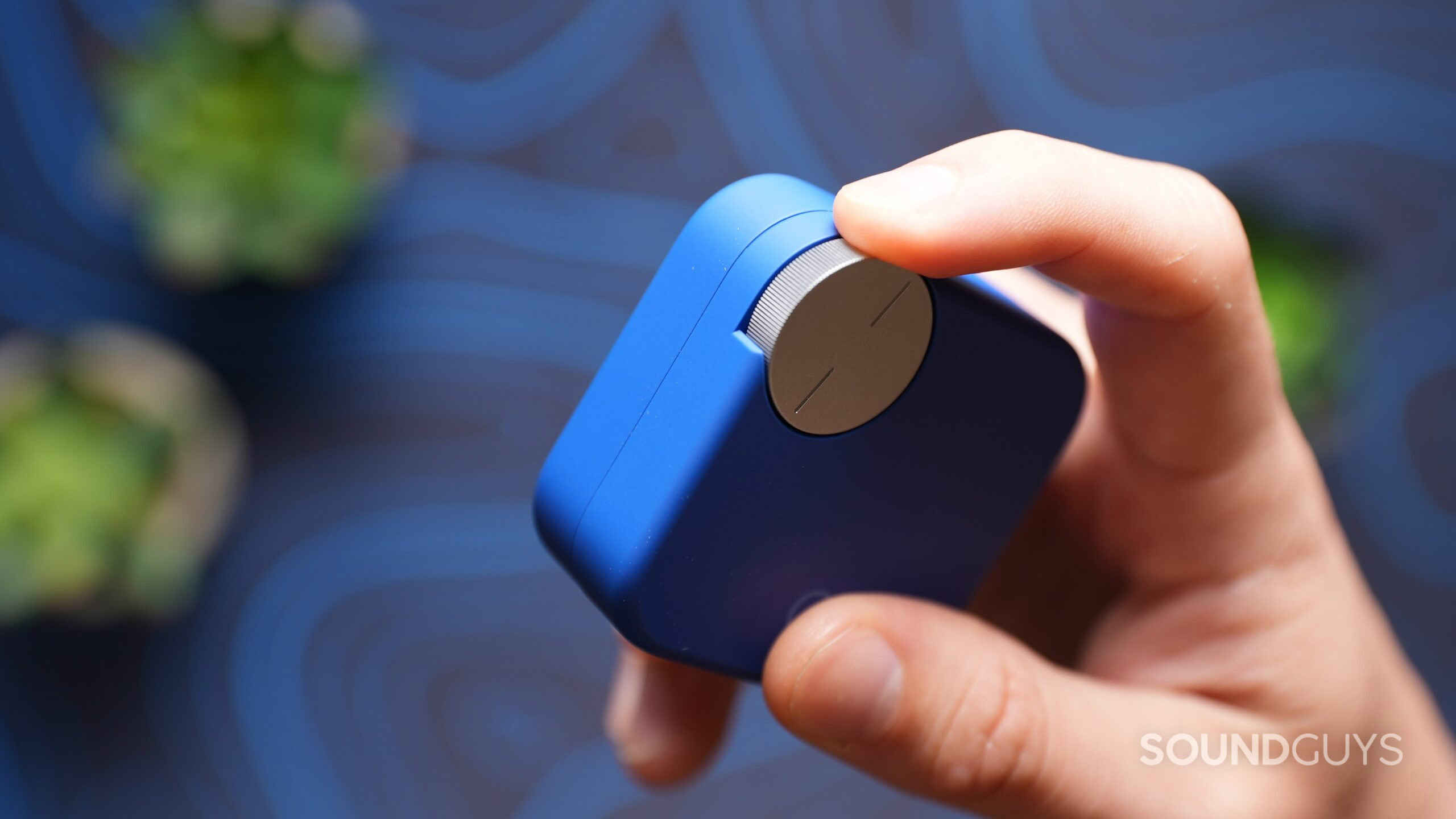
Enter the CMF Buds Pro 2. These budget-friendly earbuds have introduced one of my favorite new features of the year: the Smart Dial. It’s a physical control on the case that allows users to adjust volume, skip tracks, and even toggle noise cancelation modes – all without a single pixel. Personally, this is my preferred choice.

The Smart Dial offers several advantages over its touchscreen counterparts. First, there’s the tactile feedback. You can control your audio from within your pocket without even looking at the case, which is perfect for when you’re on the go. It’s intuitive and satisfying to use (think fidget toy) and is easier to multitask with if you are engaged with something else.
I can control the CMF Buds Pro 2 via the case without even taking it out of my pocket.
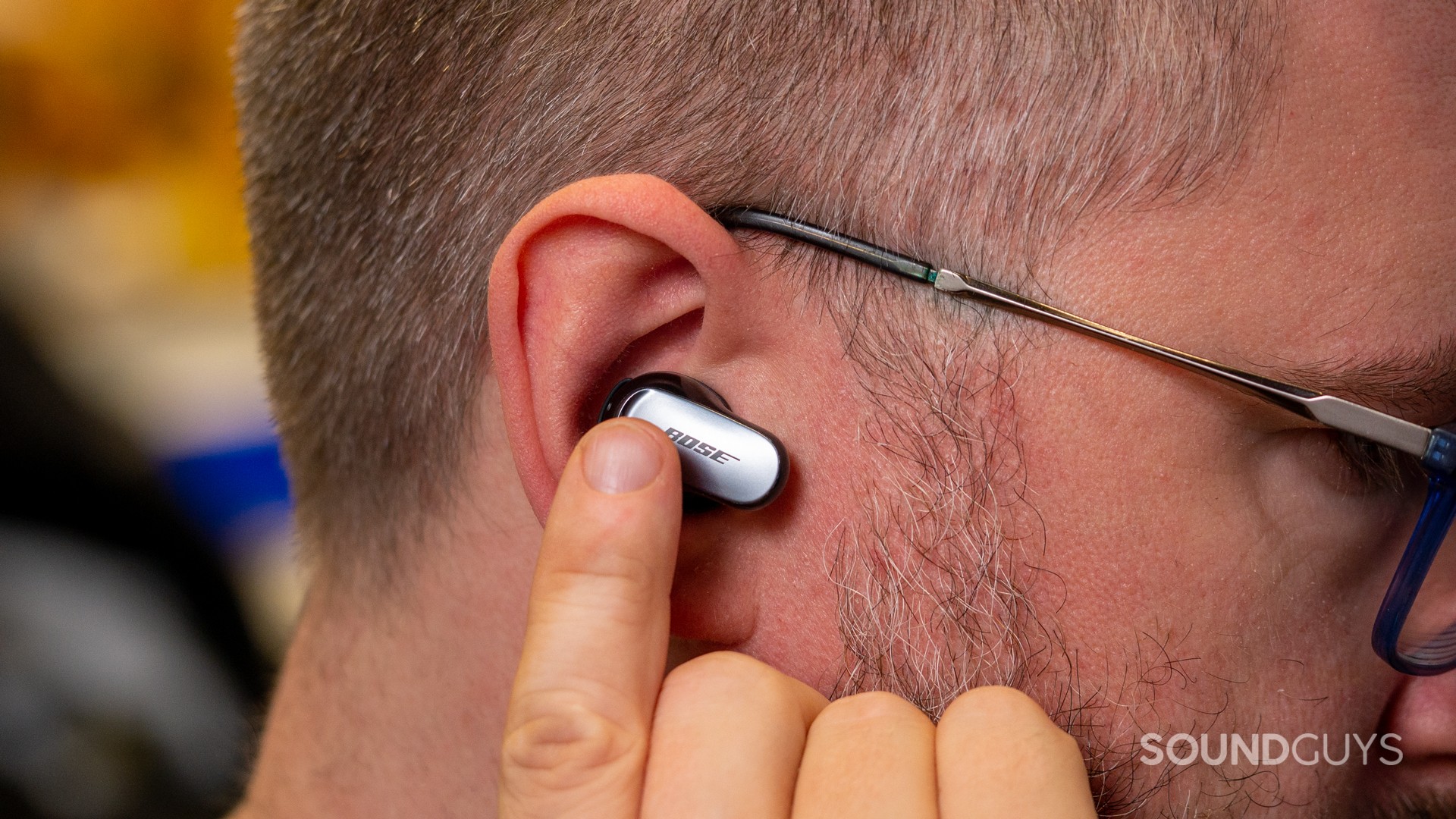
Still, whether it’s a touchscreen or a physical dial, having controls on the case itself is the true innovation. Why? Because it solves a problem that’s plagued earbud users since their inception — the fragile seal break of touch controls.
There are some exceptions, but for the most part, every time you tap or swipe your earbud to change a setting, you move the earbuds, inadvertently adjusting the fit, risking breaking the seal in your ear, compromising sound quality and noise isolation. Case controls eliminate this issue entirely.

Of course, user preferences will vary. Some may prefer the visual feedback and potentially broader range of controls offered by a touchscreen. Others, like me, might gravitate towards the simplicity and tactile nature of a physical control like the Smart Dial.
Screen or no screen, let's keep the music in our ears and the controls in our hands.
As this trend continues to evolve, we’ll likely see more innovations in case controls. Perhaps future iterations will combine the best of both worlds – tactile controls with optional visual feedback for those who want it.
Regardless, the real innovation, I think, is in bringing controls to the case itself, as they free us from the constraints of earbud touch controls and the risk of falling down the rabbit hole of notifications and apps when all you wanted to do was turn up the volume. So, the next time you’re in the market for new earbuds, maybe consider not just the buds themselves but also how you’ll control them.

